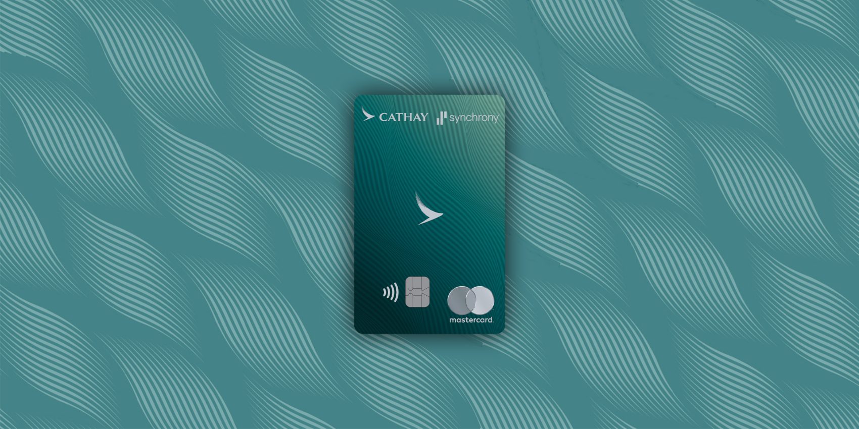
Whatever the era, the Cathay logo has always been an iconic emblem. A feathered sweep in rich jade green, simultaneously evoking an elegant bird in flight and the fluid calligraphy of an ink-drenched brush, our Brushwing is instantly recognisable.
Whether emblazoned on the tailfin of a Cathay Pacific aircraft, pinned to the lapel of a crew member or as a reassuring beacon glowing above the check-in desks in a busy Departures hall, it has become the defining symbol of the Cathay brand. Yet the Brushwing represents only the latest chapter in a visual journey that spans eight decades.

Credit: Elvis Chung
For 80 years, Cathay’s logo has evolved alongside the brand itself. Each design reflects a different moment in our history, charting our transformation from a young Hong Kong carrier into a globally recognised travel lifestyle brand. As aircraft, cabins and networks have changed, so too has the way we present ourselves to the world.
Our earliest visual identities reflected the ambitions of a young airline looking outward from a world city. From 1946, we used a globe motif paired with the initials “CPA” (Cathay Pacific Airways) and a symbolic, upwards-pointing “jetflash”. These design elements appeared in numerous variations across aircraft, timetables, luggage tags and promotional materials. In its earliest form, the globe centred on the Pacific Ocean, expressing the founders’ aspiration that the airline would one day span the Asia-Pacific region.

Credit: Elvis Chung
During the 1950s, the globe was progressively redrawn to reflect our expanding route network. The artwork shifted towards South East Asia and was later extended to include Australia, while the lettering evolved from “CPA” to “Cathay”. Rather than a single fixed logo, these changing designs formed a family of related marks throughout our early decades.
By the mid-1960s, the Swire flag had been introduced and the jetflash evolved into a golden arrowhead. First appearing on aircraft liveries and crew insignia before becoming widely used across printed materials, it brought a stronger sense of consistency to the brand and remained our principal graphic identity throughout the 1970s.
During the 1980s, a tailfin-inspired symbol incorporated the airline’s distinctive green-and-white livery, known affectionately as the “lettuce leaf sandwich”. By 1983, it had become the dominant brand marker, and in 1988 the first comprehensive Graphic Standards Manual was published, establishing formal guidelines for logo construction, colour usage and brand applications across the business.

The most consequential redesign to date appeared in 1994. Created by branding agency Landor Associates, it introduced the Brushwing, a new emblem inspired by a single stroke of a calligraphy brush. Set within a green panel and paired with elegant typography, it distilled movement, grace and an unmistakably Asian sensibility into one memorable symbol. Over the decades that followed, it became synonymous with Cathay, appearing across aircraft, lounges, uniforms and communications around the world.
A refinement in 2014 removed the surrounding green box, allowing the Brushwing greater prominence and giving the identity a lighter, more contemporary feel. It was a subtle evolution that retained the equity of one of aviation’s most recognisable symbols.
The latest chapter began in 2023, when Cathay Pacific became simply “Cathay”, reflecting the strength of a broader premium travel lifestyle brand encompassing flights, holidays, shopping, dining, rewards and more. The Brushwing remained at its heart, repositioned alongside the wordmark. Nearly 30 years after its debut, the symbol continues to anchor and define our visual identity.
From globes and jetflashes to the enduring Brushwing, our logos chart not only changing design trends but also the evolution of an airline rooted in the spirit of Hong Kong, shaped by Asia and always looking outward to the world.