


How colour influences our travel memories

Picture yourself in a boat on a river with tangerine trees and marmalade skies. That’s not me putting in a request, but John Lennon writing Lucy in the Sky with Diamonds for The Beatles in 1967. Lennon was dosed up on Lewis Carroll and LSD: today, he’d just need to click on an app.
Specifically, Instagram and even more specifically, a feed called Beautiful Destinations . BD has upwards of 12 million followers and inspires people ‘to travel, to connect and to have a positive impact on the world’.
Credit: JP Klovstad/Getty
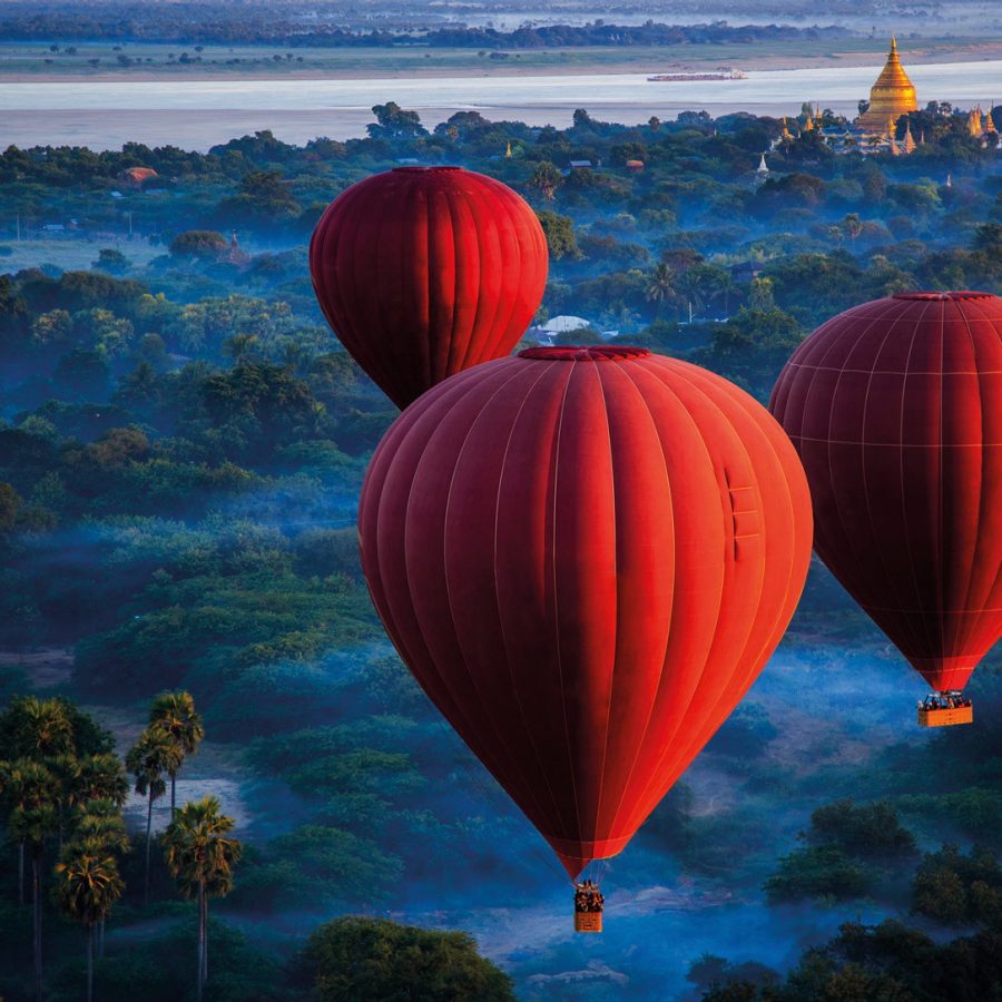
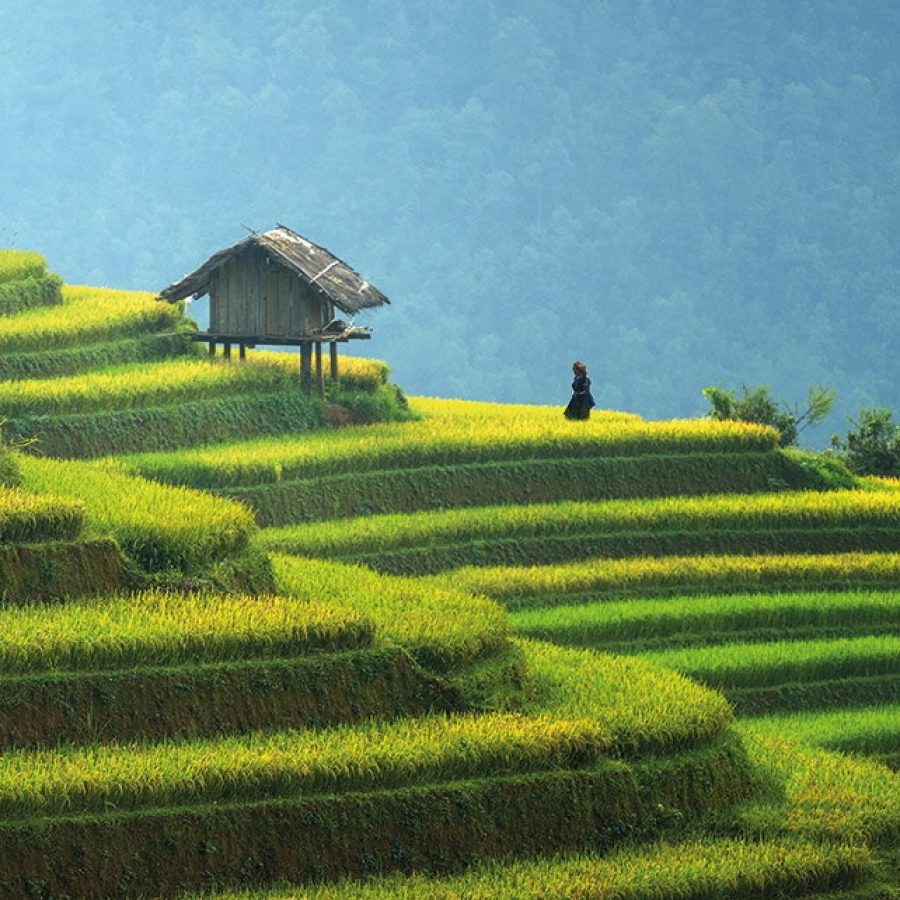
Here on today’s feed is the sky above Quebec: it’s otherworldly, the colour of Jupiter’s atmosphere. Then Italian hot springs: swirls of turquoises and caramels, good enough to eat. Forcalquier, a village in Provence: bright terracotta roofs set against pine-clad hills, the last of the sun kissing the mountains behind, a scene seemingly lifted straight from a big-budget romantic epic.
Elsewhere there are purple fields, pink trees, amber sunsets and emerald seas and, no doubt if you look hard enough, tangerine trees and marmalade skies.
Credit: Getty Images
BD co-founder Tom Jauncey has some good advice for prospective posters. He passes on what pro travel photographers have known forever: shoot early in the morning and just before sunset. He also recommends tools: Snapseed , Lightroom , Color FX – they help you to get the ‘bold colours and saturation’ that attract the Likes like bees to fields of clover… clover, were it a BD picture, that would doubtless be fluorescent green and scorching hot pink.
So here’s the question. It’s an amazing world we see on Instagram: but is it any more real than the phantasmagorical world of the cartoon The Beatles made for Lucy in the Sky with Diamonds?
Credit: John W Banagan/Lonely Planet Images/Getty Images
Colour belongs in the realm of physics (the way light refracts and diffuses), physiology (the way the retinas of mammals such as humans react to light) and psychology – how colour makes us feel and how it changes our moods. The first two obey unchanging laws of nature. The last one is far less reliable. The way we perceive colour can be moulded and reshaped by cultures, technology and skilful artists. The Beautiful Destinations contributors are only the latest in a long line of people who have literally (for once that word is spot-on) changed the way we see the world.
Credit: Lars Ruecker/Getty Images
It’s probably not a coincidence that the golden age of landscape painting (landschap, from the Dutch) coincided with the beginnings of modern tourism. Before then, in the West, landscape was scenery: a backdrop to a biblical scene or a dramatic touch for a portrait. There are lakes, forests and streams in the Mona Lisa: but it’s the smile that captivates us. In China, especially during the golden era of the Song dynasty, techniques and materials that were far in advance of anything in the West allowed artists to capture landscapes that were subjective: spiritual and emphatically not intended to represent what was ‘really’ there.
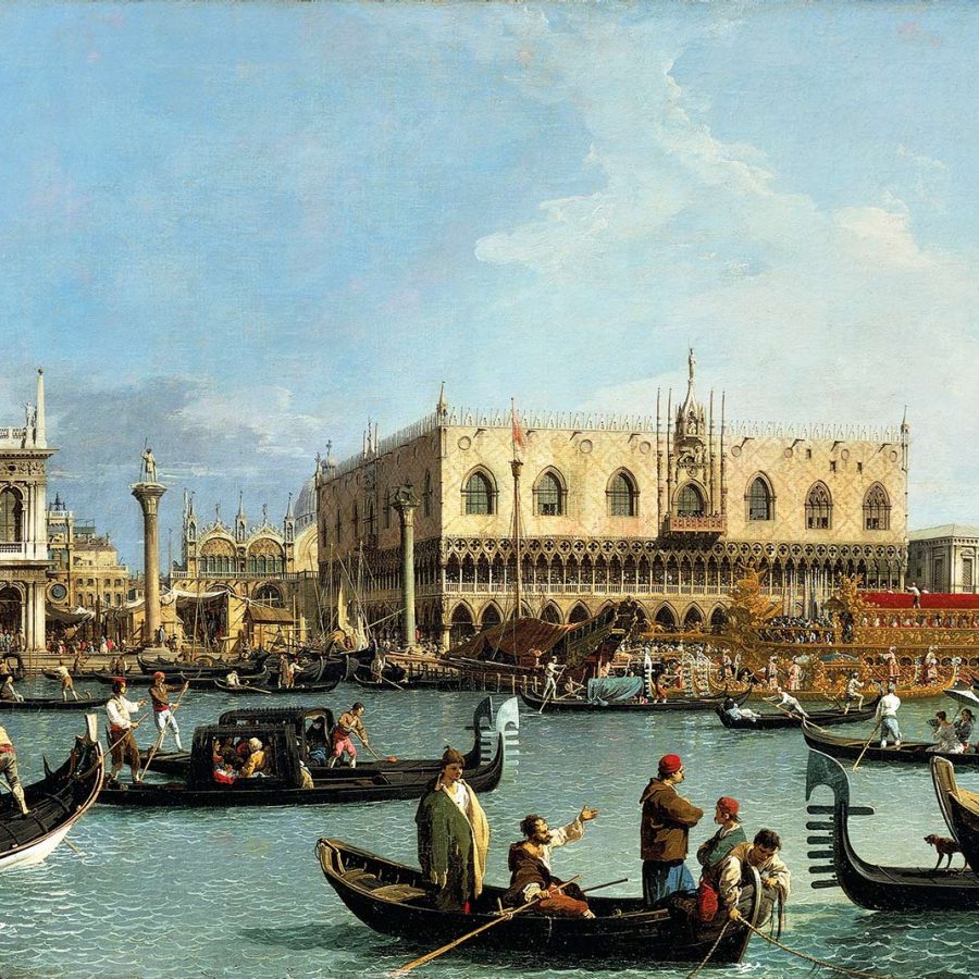
Landscapes began as cityscapes: artists such as Vermeer (the View of Delft) and Canaletto (his many scenes of Venice, Rome and London) created a vogue that expressed civic pride and attracted wealthy visitors and collectors. In these works, nature is a sympathetic colourist and lighting expert: mankind’s achievements are the focal points. I look at the Beautiful Destinations cityscapes today and see echoes of Canaletto: the formal composition, the stillness, the baths of warm light. This is colour psychology, remember. You’re suffused with a sense of timelessness, permanence, distance from the real chaotic business of a metropolis. You feel sort of… noble.
Credit: Sasin TIPCHAI/Getty Images
Compare that with a very different kind of urban photography. I once visited the late Michael Wolf in his Chai Wan studio. It was one of those flat, blank Hong Kong days where sun and cloud have both taken the day off. I sympathised with Michael: terrible light for a photographer. Quite the opposite, he said. He loved days like this. And in Wolf’s celebrated Hong Kong cityscapes, the lack of light effects means his walls and windows and hillsides can’t hide. For him, this was the most truthful way of capturing colour and form.
But Michael’s work wouldn’t have done well on Beautiful Destinations.
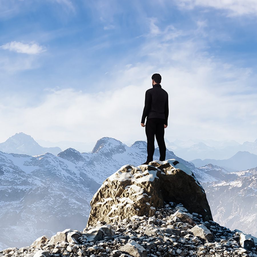
He’d also have ignored Tom Jauncey’s advice: put people in landscape shots. In an interview with photography site Adorama, Jauncey says: "If you’ve got a massive view of Yosemite and you put someone on a little rock, and you see them in comparison to the monument or landscape, then you can really show scale." (He also advises them to wear a red jacket: "red always pops.")
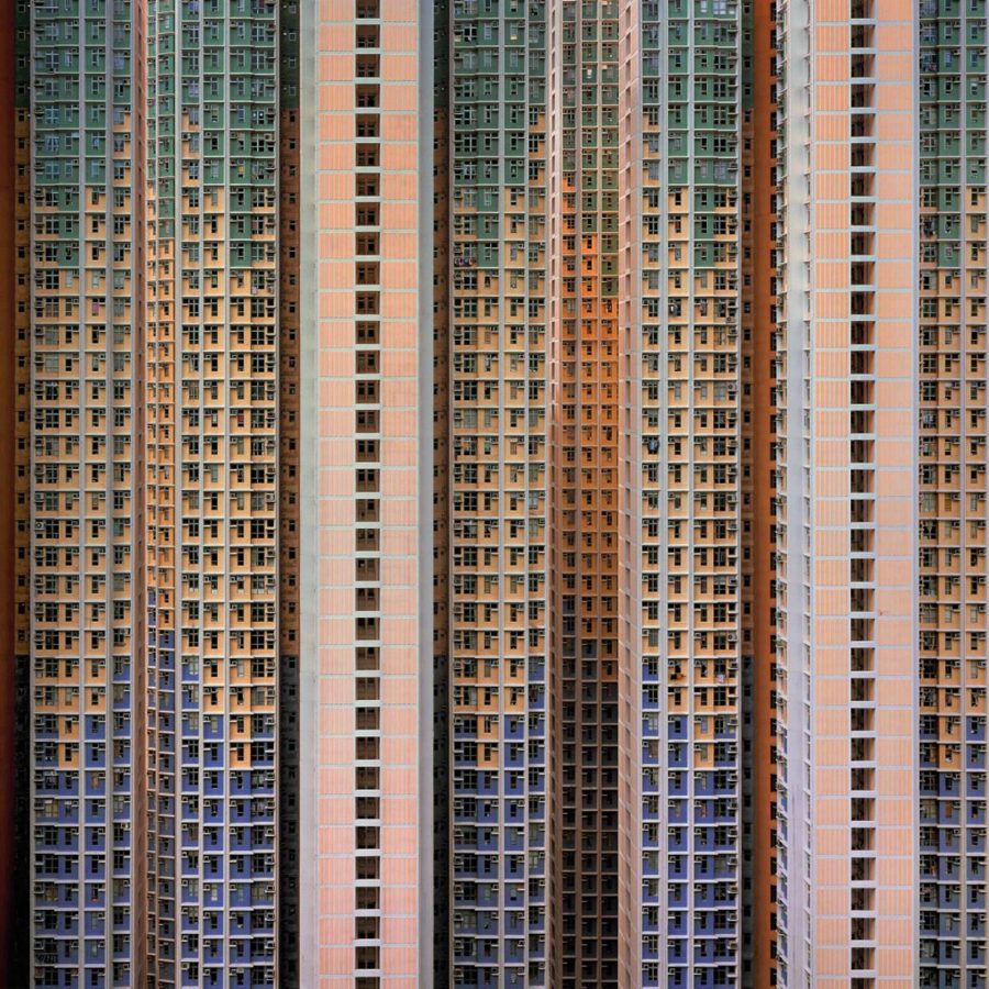
Credit: Michael Wolf
That’s precisely what the next generation of landscape painters after Canaletto and Vermeer did. They went out into the country, the wilder and more mountainous the better, and put little people in the frame. Because these Romantics were also obsessed with the scale of human beings set against the awe of nature. Only that was a metaphysical obsession: the anguished, Byronic search for meaning in the universe. This is a bit different to, say, that bloke who shoots his girlfriends taking him by the hand in various picturesque locales.
The all-time viral Romantic painting from this era is Caspar David Friedrich’s Wanderer above the Sea of Fog, in which a young man in a green overcoat – if only they’d had red Gore-Tex in 1818 – stands on a mountaintop and surveys a whirling, pearlescent sea of cloud and crags.
Credit: Getty Images
Critics are divided whether the scene depicts man’s mastery over nature or his insignificance in its presence. I’m more interested in what Friedrich himself said about it: "The artist should paint not only what he has in front of him but also what he sees inside himself." That’s just as well, as he chucked all sorts of different locations into that single painting.
But that is exactly how the great masters of Chinese ink saw the world. Everything – colour included – is subjective. Memory is a composite of places, textures and colours.
The watercolour and oil landscapes of the 18th and early 19th centuries created a tourism industry. The Grand Tour – the preserve of rich young aristocrats – faded away and groups of more middle-class travellers began seeking their own slice of the sublime in the Alps or the Black Forest.
Credit: DeAgostini/Getty Images
But it was the Impressionists who really opened up a new world of colour and tourism.
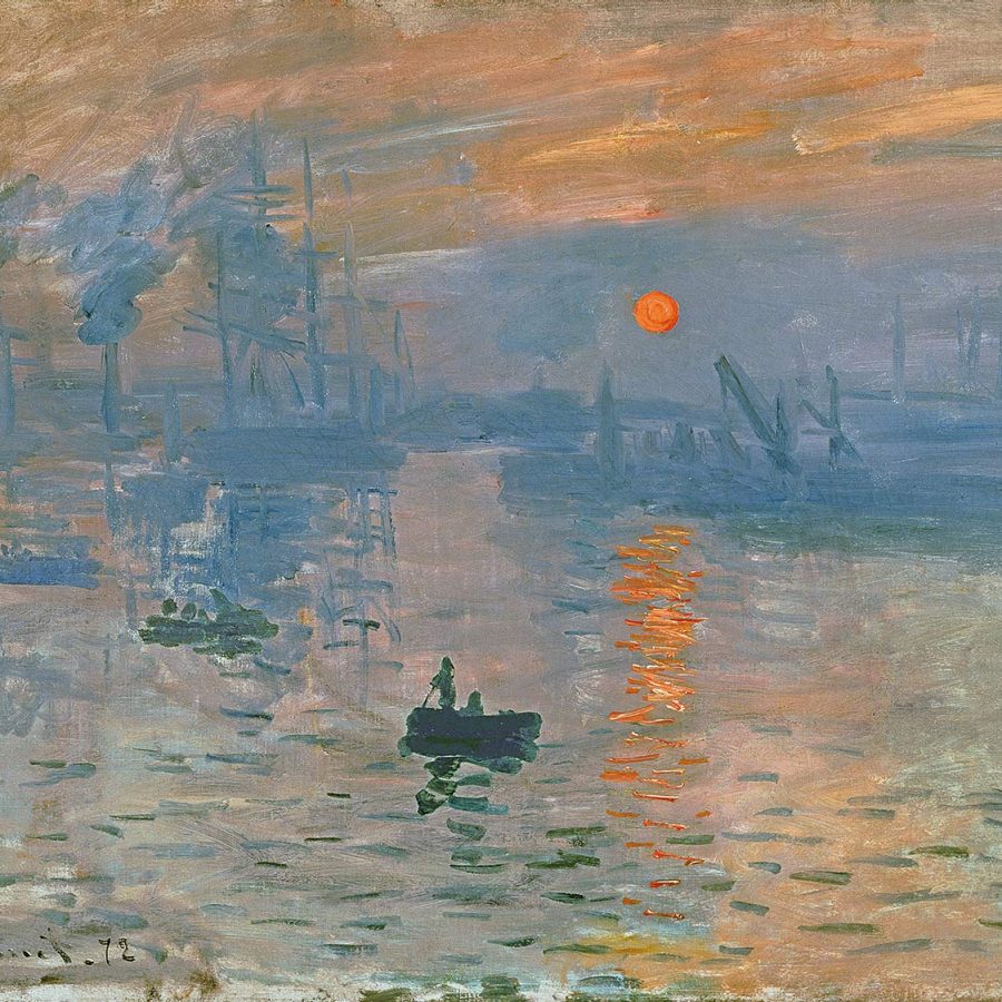
In 1874, Claude Monet exhibited a painting of his hometown port of Le Havre called Impression: Sunrise. Was it that revolutionary? After all, the English artist JMW Turner has captured seascapes and sunrises that were even more dreamlike, with borders between light, colour, water and air that were even more permeable. But Monet and the Impressionists had a mission. First, they would get out of the studio and paint en plein air. Second, they’d avoid those grandiose scenes of mountains, Arcadia and battlefields. They’d paint riversides, meadows, chairs, bars, people having lunch and walking through gardens (sometimes with clothes on, sometimes not): and they’d make every scene luminescent, full of colour and lustre.
The immediate beneficiary – and it’s still benefitting to this day – is the French region of Provence. In the same year that Monet showed Impression: Sunrise, the railway opened between Paris and Marseilles. Off south went the artists with their easels, absinthe and mistresses: and we’ve been following them ever since, in search of Van Gogh’s sunflower fields, Renoir’s farmhouses, Raoul Dufy’s balconies – and above all, that shimmering, seductive light and colour.
‘Impression’, painting the psychological effect a scene has on you – a sometimes unbearable effect in Van Gogh’s case – rather than what’s strictly there, was a riposte to the spread of photography. Yet for decades and decades, photography was more interested in news and portraits than landscape; and pretty much stumped by colour. The greatest landscape photographer of all time, Ansel Adams, said shooting on colour film was like playing an out-of-tune piano.
Credit: Fine Art Images/Heritage Images/Getty Images
But slowly, we began to see and record the world in new colours: often bleached out, sometimes muddy and indistinct – but colour nonetheless. Kodachrome film was launched in 1948 and for 50 years we fiddled with shiny black rolls of film, waiting weeks for an envelope of prints to come back. When I visit my parents’ home, I spend hours sifting through albums and folders of the things: Welsh castles seemingly photographed through a dark sock, my mother in a French village during what appears to be, but which can’t have been, a solar eclipse. And if I think of my pre-digital childhood, a place of brown furniture, burnt-orange cars, fields the colour of straw, am I remembering those colours – or seeing the colours in the photographs they took at the time?
Any single one of the 16,603 photographs currently on my computer is a masterclass in colour, vividness and sharpness compared to those drawerfuls of prints in my childhood home. But you can’t help wondering how today’s state-of-the art filtered, saturated and enhanced Instagram shots will serve us in the future. I remember going to Milan – but was it really under marmalade skies?
More inspiration
- China – the Chinese Mainland, Hong Kong SAR, Macao SAR and Taiwan Region
- Hong Kong SAR - English
- Chinese Mainland (China) - English
- Taiwan, China - English
- 香港特別行政區 - 繁體中文
- 中国內地 - 简体中文
- 中國台灣 - 繁體中文
- Africa
- South Africa - English
- Asia
- Bangladesh - English
- Korea - English
- Singapore - English
- Cambodia - English
- 한국 - 한국어
- Sri Lanka - English
- India - English
- Malaysia - English
- Thailand - English
- Indonesia - English
- Maldives - English
- ประเทศไทย - ภาษาไทย
- Indonesia - Bahasa Indonesia
- Myanmar - English
- Vietnam - English
- Japan - English
- Nepal - English
- Việt Nam - tiếng Việt
- 日本 - 日本語
- Philippines - English
- Australasia
- Australia - English
- New Zealand - English