When the Hong Kong government gave the go-ahead to build a new Mass Transit Railway (MTR) system in 1972, it was the fast-growing city’s first public investment in rapid transit. But the government did not dig deep into its pockets. It allocated a comparatively puny HK$5 billion to build the initial 20-kilometre system.
The result was efficient but bare-bones. ‘There was almost no architecture in the early station designs,’ says MTR chief architect Andrew Mead. ‘It was very utilitarian. No lifts, no toilets, escalators that didn’t go all the way to the ground.’
Credit: Ben Marans
But the MTR’s first chief architect, Roland Paoletti, had a plan to give the new system some personality, despite the government’s tightly drawn purse strings. ‘It was his vision to bring colour into the stations,’ says Mead.
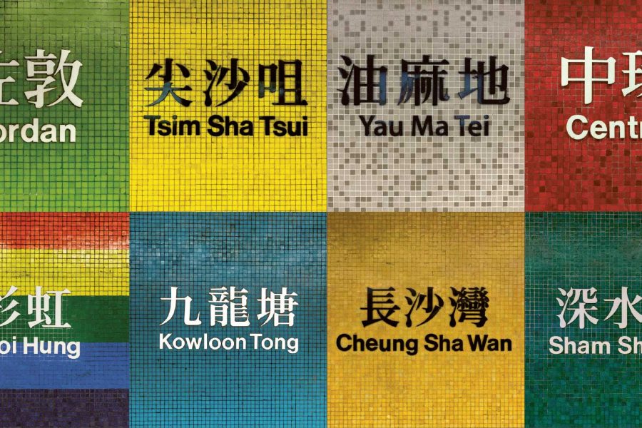
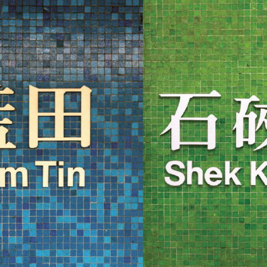
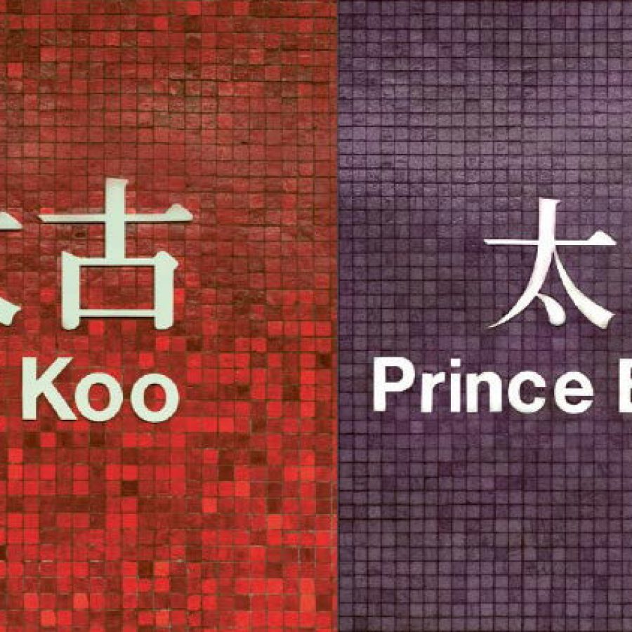
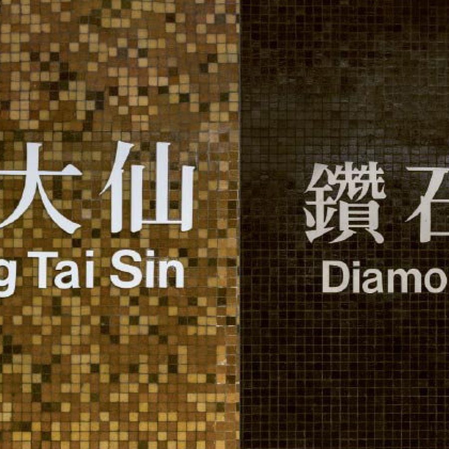
The result is a rainbow of distinctive stops: Admiralty is blue, Central is crimson, Tsim Sha Tsui black and yellow. Mosaic tiles were Paoletti’s medium of choice, as they were cheap and readily available. For the most part he stuck to a simple palette, with a few flights of fancy – like the rainbow-coloured pillars of Choi Hung (which means ‘rainbow’ in Cantonese) or the silver-flecked black walls of Diamond Hill.
The station colours were a cost-effective way to give the new system a distinctive visual identity, but they also served a practical purpose, as many people in Hong Kong were still illiterate in the 1970s.
Credit: Ben Marans
Over the years, though, that identity began to fade. MTR stations built in the 1990s and 2000s tended towards a neutral palette of whites and greys, with solid plastic or aluminium panels.
When Mead arrived at the MTR in 2013, one of the first things he did was to dig into the system’s heritage – the things that make it distinct from the hundreds of other metro systems around the world. ‘It boiled down to three things – the bold use of colour, the use of mosaics and the use of calligraphy,’ he says.
A number of new stations were already under construction when Mead arrived, including those of the new South Island and West Island line extensions. Mead added colourful mosaic tiles where he could, such as in the West Island line’s lift shafts. Mosaic also found its way into new artworks like Admiralty station’s Playcode by Hong Kong architects plusClover, which uses grey and blue tiles to create both Morse and QR codes that reference the naval heritage of the area and modern communication.
Credit: Ben Marans
As the MTR expands and its ridership grows with every passing year, Mead has tweaked some of the colours to adapt to this more crowded reality. When new connections were built in Admiralty station for the South Island line and the upcoming Shatin-to-Central link, Mead decided the busiest part of the station should be clad in white and grey to make the space calmer and make it easier to find the wayfinding signage.
Elsewhere, expect colours as vibrant as the original stations. The main difference, says Mead, is that future MTR stations will employ a mix of materials and colours, rather than the monochromatic approach employed in the 1970s. ‘Our future stations will be accented with colours to express their personality,’ he says. ‘It’s my way of moving us on, respecting our heritage and creating designs that are appropriate for the 21st century. It’s a work in progress.’
Hero image: Ben Marans